Cardinal Directions Society Website
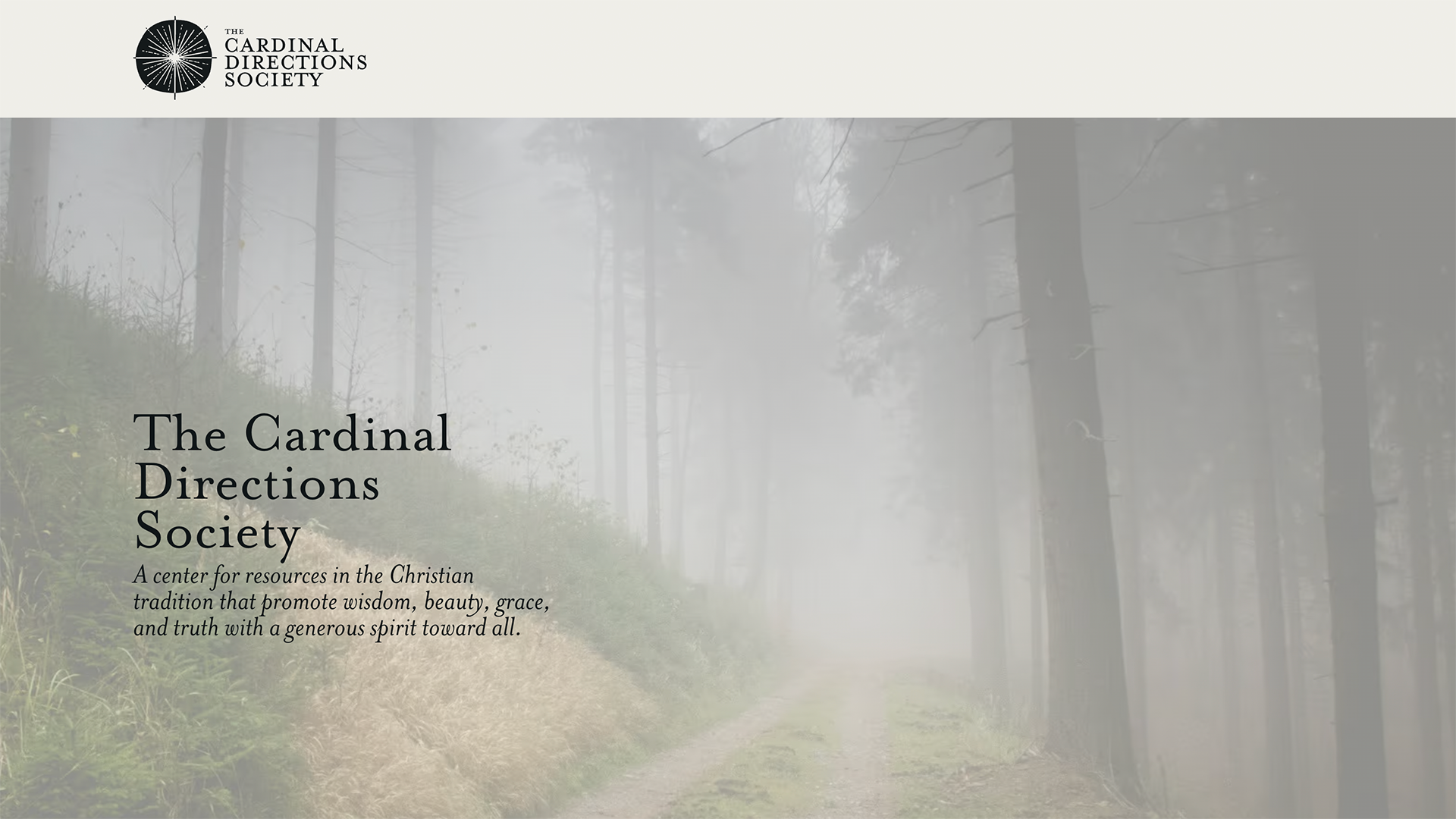
The Cardinal Directions Society came to me as a new organization with a clear sense of mission and a name that was already doing a lot of the conceptual work. Their aim — to produce and curate resources in the Christian tradition with a generosity of spirit toward all — called for something that felt substantive and unhurried. I handled both the branding and the website, which meant the two could develop together.
The visual identity anchors on a starburst compass mark — a form that echoes both the cardinal directions of the organization's name and the four "directions" of spiritual life at the center of their work. On the web, the design extends that language into a palette of warm earth tones, considered typography, and a restrained layout that gives the content room to breathe. The site needed to carry weight for an organization still in early days, before a full body of published work could do that job on its own.
This is a single-page launch with more pages and programming to come. What's live is a foundation — something that establishes who they are clearly enough that the work can grow into it.